
Reducing Churn for FuturaSpace
Redesigning FuturaSpace: Reducing churn rate and driving sales in an SaaS Platform
Overview.
ROLE
UX Researcher - UX Designer
TIMELINE
6 Weeks
TOOLS USED
Miro / Figma
This was a fictitious project as part of RMIT University’s Graduate Certificate of UX Design.
As part of this project I am considered a design intern at the agency DiamondWater
FuturaSpace is a startup with teams working both in Australia and Germany. It aims to provide sole traders, startup entrepreneurs and web designers the ability to create high-end tailored websites without the need for substantial technical knowledge or coding.
The Problem Space.
The existing website currently suffers from:
1. Low conversion rate
2. Users leaving the site prior to signing up
3. Confusing navigation and lack of user guidance
FuturaSpace wants to improve their user experience, reduce churn rate and drive sign-ups to see an ROI in 12 months.
In order to reduce churn rate, drive sign-ups and improve the overall user experience of FuturaSpace’s website, the following research goals were developed:
1. Understand what features/information users are drawn to on the website
2. Identify friction points in the sign-up process
3. Redesign the navigation to better align with business goals and user needs
Our Research Goals.
Research Approach.
Research Modes.
The following research methods were adopted to address the research goals:
Usability testing with three participants (one web developer, one procurement employee and one coordinator for a charity)
Semi-structured interviews with three participants
Analysis of Hotjar analytics and heatmaps including feedback surveys
Analysis of data analytics provided by the client (drop off points and user flow data)
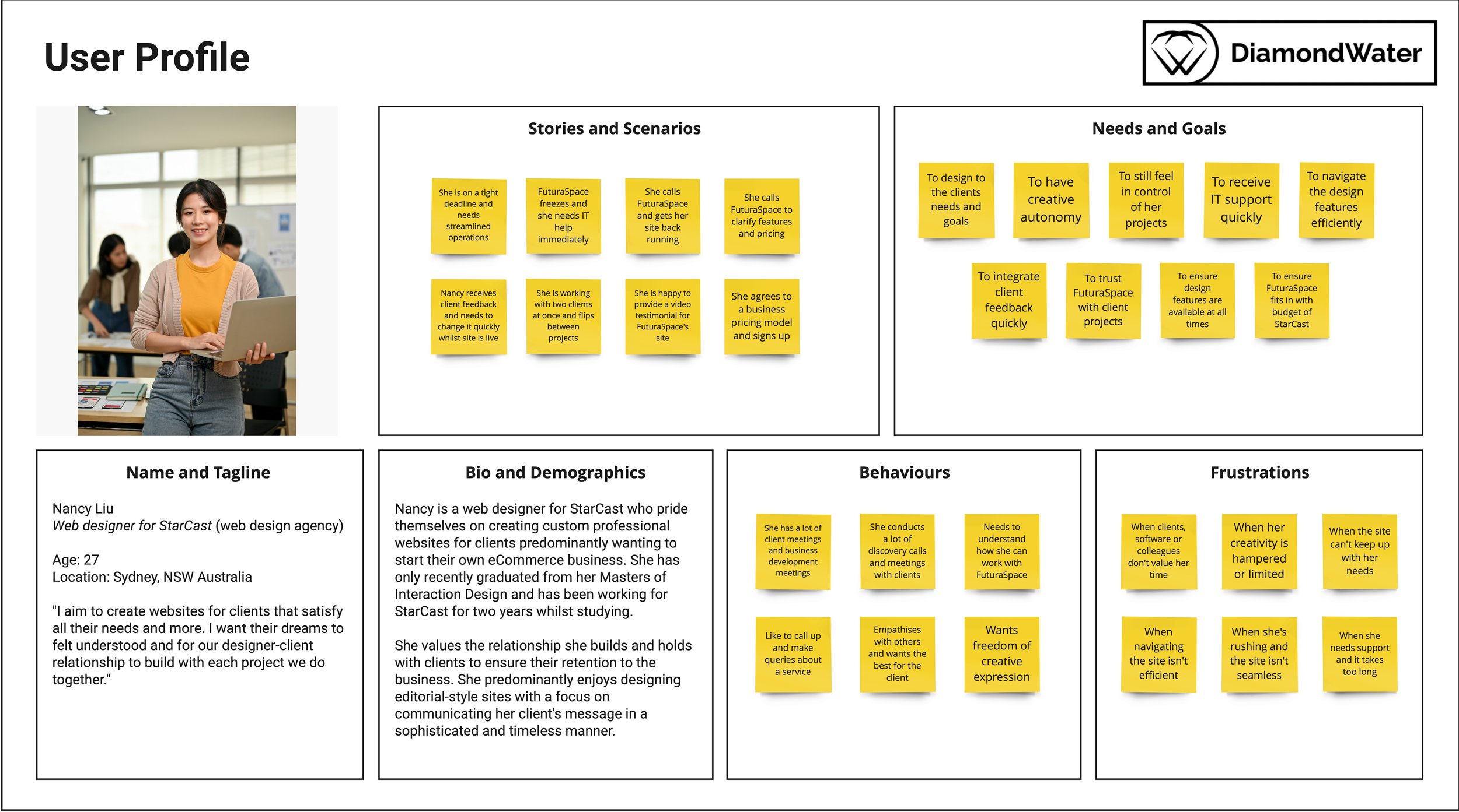
Defining Users.
Personas were then developed to identify the goals, tasks and frustrations of typical FuturaSpace users. These were informed by user interviews and survey responses.

Mapping the Journey.
A journey map was created to discover user flow throughout the FuturaSpace website and reflect the registration process:

Key Insights.
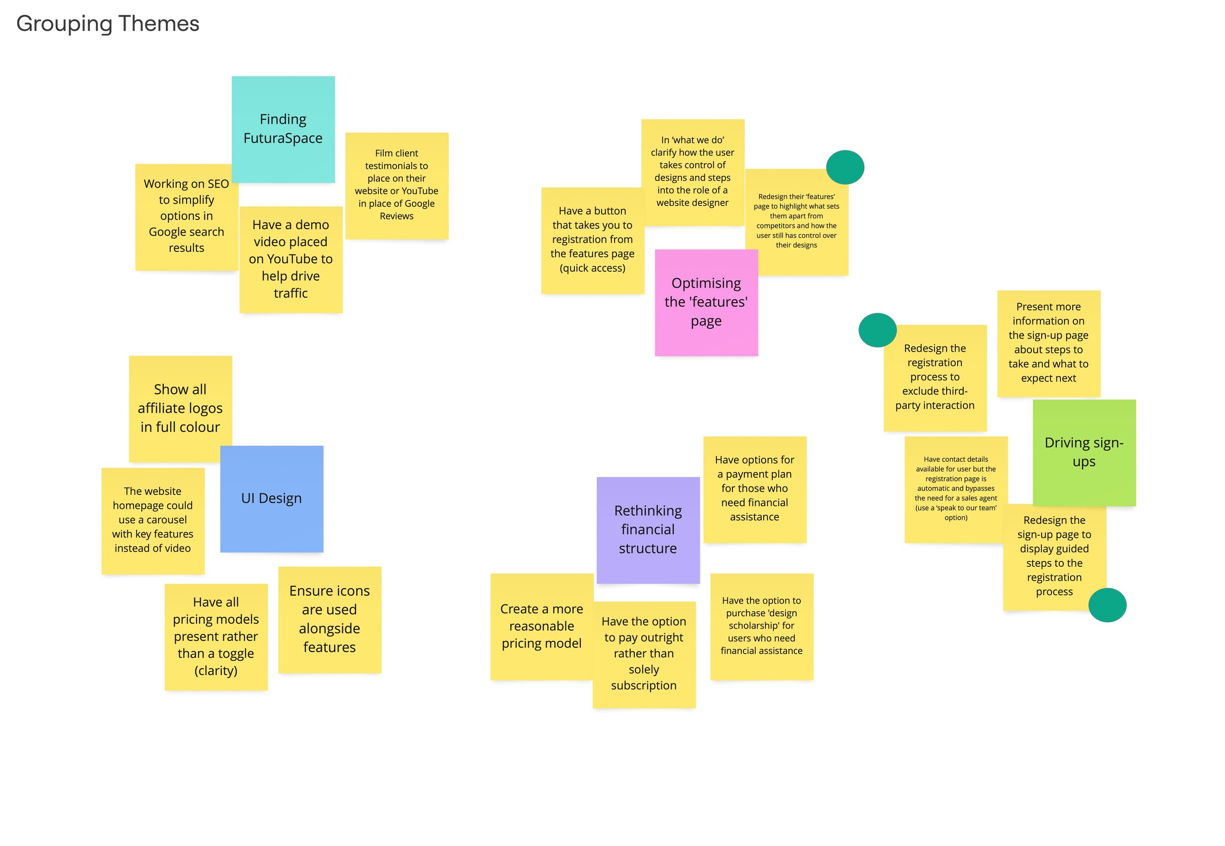
FuturaSpace’s analytics and DiamondWater’s research have been integrated into an affinity map (see below) to uncover two prioritised themes:
Optimising their website’s ‘features’ page
Driving sign-ups through registration
A journey map (see above) was then created illustrating the process from finding FuturaSpace online to signing up for their services. Many pain points were uncovered, however the following are the most important to note:
The ‘features’ section does not discuss how much creative control the user has when using FuturaSpace
Users do not feel comfortable leaving their contact details when registering as they do not want to be contacted by a sales agent
Users feel lost and there is no clarity nor guidance in how to flow through the registration process
These pain points were informed by key user insights. These have been prioritised below:
Users are firstly interested in FuturaSpace’s features before pricing
Users appreciate clarity, transparency and being guided through a sign-up process
Users do not need to access FuturaSpace’s contact information when registering
These key insights and pain points as well as other conducted research have informed two user personas included.
Affinity Mapping to Identify Themes.
An affinity map was created to identify key themes that users deemed significant to improving the overall user experience and registration process:
Design Strategy.
These are some ways FuturaSpace could address the above pain points and improve their user experience to reduce churn-rate long term and increase conversion:
Redesign their ‘features’ page to highlight what sets them apart from competitors and how the user still has control over their designs
Redesign the sign-up page to display guided steps to the registration process
Redesign the registration process to exclude third-party interaction.
Redesigning the Features Page:
The features page should be redesigned as FuturaSpace’s analytics and DiamondWater’s interviews demonstrate that users like to understand FuturaSpace’s service features before accessing their pricing model.
This will lead to an increase in conversion and following through on this promise will lead to customer retention.
Redesign the Sign-Up Page:
The Hotjar analytics indicate that 56% of users did not sign up as they did not find what they were looking for or they were uncertain of the steps after signing up. After users have chosen a subscription plan and select ‘get started’, the registration window they are led to should have a three-step guide as suggested below rather than a generic submission confirmation:
Select your subscription plan
Register your FuturaSpace account information below
Please check your inbox for an account activation email and follow the prompts
Ensuring users are aware of the registration process and their progress through it will prevent them from getting lost within the site, will improve overall user experience and will reduce long-term churn rate.
Excluding Third-Party Interaction:
DiamondWater interviews found that users generally lack time. Due to this lack of time in combination with wanting to withhold personal details, users do not want to speak to a sales agent. The user experience of the sign-up process could be improved by treating it like creating a website account rather than a ‘contact us’ form:
The user selects their preferred subscription plan which takes them to a registration page
They then leave their name, email, billing information and create a password
They get sent an activation email to their nominated email address and their subscription cycle begins, giving them full access to FuturaSpace’s service features
This will reduce long-term churn rate, increase conversion and reliable IT support will lead to user retention.
Implementation and Redirection.
The above recommendations were implemented by FuturaSpace; however, our recommendations did not resolve the problem of churn rate.
We originally found that FuturaSpace’s features page and registration process needed to be optimised to drive sign-ups. Website analytics did not present enough information to suggest why users were leaving the site, particularly on the fifth and sixth pages. Hotjar analytics found that users were also confused on the process after sign-up. These led us to believe churn rate was a problem of the registration process itself, but recent findings suggest otherwise.
The Solution:
The solution to churn rate lies in the end-to-end customer experience. This has been deduced given the gaps in data:
The website analytics fail to display information outside of the website experience itself
The Hotjar analytics also fail to give information about the experience prior to accessing the website, however 43% of users left survey answers blank
25% users also needed more information prior to signing up
I created a revised journey map outlining the journey of all three interviewees before and after they find the FuturaSpace website:

Redesigning for Churn Rate.
Addressing Bias.
Expanding research to include the end-to-end customer experience. This will help resolve framing bias and confirmation bias. User interviews could also be conducted with users who disengaged to understand their motives for doing so. This would help resolve sampling bias. It would also be beneficial to analyse how users interact with external touchpoints like social media and marketing materials.
Next Steps for Churn Rate.
After revising our journey map and expanding the research window to before and after sign-up, the following opportunities to reduce churn rate have been identified:
Aligning marketing materials (ads, emails and social media) to demonstrate what users will experience when using their service and set up clear and transparent expectations
Use ads or emails offering personalised incentives to address users who began the sign-up process and dropped off to re-engage (e.g. limited discounts)
Offer a loyalty or referral program to improve user base and encourage user loyalty
Improve engagement post-visit by sending helpful content via email (e.g. online tutorials, testimonials or a newsletter)
Addressing Principles.
The following principles have been created to reduce churn rate:
Clarity over conversion: Use transparency in pricing and marketing materials to set up clarity in expectations.
Guide and support: Provide step-by-step processes and constant support.
Engage and expand: Offer online tutorials, website design newsletters and referral incentives
Continuous learning: Use online newsletters to teach design foundations and give users confidence
Invite to return: Show customers are valued with a loyalty or rewards program
Success criteria would involve seeing a reduced churn rate, higher conversion rate, greater user retention and an increasing user-base through referrals.
Lessons Learnt.
We found the following factors could have been approached differently in our research method:
There was a misalignment with client needs seen through pain points identified in the initial stages of this project
We initially failed to encompass the end-to-end customer experience and unintentionally introduced bias into user interviews and usability testing
There was a lack of clear design criteria and communication between DiamondWater and FuturaSpace which led to the need to revisit research to resolve churn rate
Reflecting on our Approach.
Final Thoughts.
The issue of churn rate is the product of poor marketing and disengagement outside of the FuturaSpace website itself. Focussing efforts in this space will not only improve the overall end-to-end user exerperience, reduce churn rate and drive sales, but will contribute to FuturaSpace seeing an ROI in 12 months to present to their investors as requested.